Which graphical representation is best for showing distribution of a quantitative variable?
🔥 Practice Quizzes
Class 8th Sanskrit MCQs
Online Class 8th Sanskrit MCQs Test Practice with detailed answers, Explanations on ExamVi...
Take QuizSupreme Court JCA MCQs
Supreme Court Junior Court Assistant (JCA) MCQs are an important part of preparation for c...
Take QuizRSMSSB JE MCQs
RSMSSB JE MCQs with questions and answers RSMSSB Junior Engineer exam preparation guide @ ...
Take QuizNBE MCQs Practice Questions
Practice NBE MCQs with answers and explanations. Improve exam preparation in reasoning, GK...
Take QuizCCRAS LDC MCQs
CCRAS LDC MCQs are an important part of preparation for candidates applying for the Lower ...
Take QuizComputer Architecture MCQs
The Computer Architecture MCQ section on ExamVibe is designed for students, competitive ex...
Take QuizAgricultural Statistics MCQs
Explore Agricultural Statistics MCQs with answers for exam preparation, competitive tests,...
Take QuizLocal SEO MCQ
Local SEO focuses on optimizing a business’s online presence to attract customers from s...
Take QuizCyber Security MCQs
Cyber security MCQs is an exclusive section on ExamVibe that is designed to aid pupils, IT...
Take QuizMPSC MCQs
The MPSC exam is conducted by the Maharashtra Public Service Commission to recruit candida...
Take QuizKPSC MCQs
The KPSC exam is conducted by the Karnataka Public Service Commission to recruit candidate...
Take QuizSSC CHSL MCQs
The SSC CHSL (Staff Selection Commission Combined Higher Secondary Level) exam is one of t...
Take QuizRRB ALP MCQs
Get ready for the Railway Recruitment Board Assistant Loco Pilot (RRB ALP) exam from ExamV...
Take QuizWest Bengal Police MCQs
Get ready with wb police MCQs for each topic from many examinations of WB police will be c...
Take QuizDigital Signal Processing MCQ
Master the fundamentals and advanced concepts of Digital Signal Processing with comprehens...
Take QuizDigital Electronics MCQ
Explore 30+ Digital Electronics MCQs with detailed answers designed to help students and p...
Take QuizAdvanced Foundation Engineering MCQ
Boost your knowledge of geotechnical and structural engineering through Advanced Foundatio...
Take QuizOrthopedic Bioengineering MCQ
The Orthopedic Bioengineering MCQ Quiz is a well defined test to assess the knowledge of t...
Take QuizTissue Engineering MCQ
Tissue Engineering MCQs – 1000+ Multiple Choice Questions & Answers Tissue Engineering M...
Take QuizAircraft Design MCQ
Aircraft Design MCQ – Test Your Knowledge and Improve Your Understanding Aircraft Des...
Take QuizEnvironmental Engineering MCQ
Environmental Engineering MCQ is a useful practice section for students, engineers, and ex...
Take QuizRRB NTPC MCQs
Get all the serious RRB NTPC MCQs in one place at ExamVibe while preparing for Railway Rec...
Take Quiz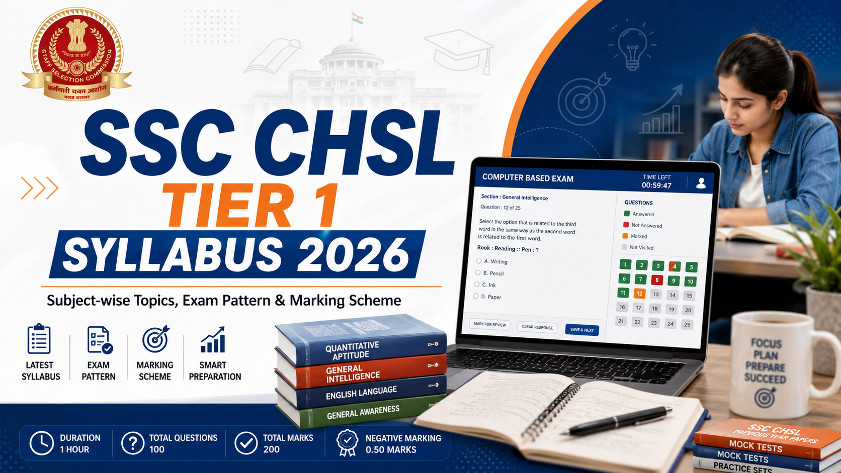
SSC CHSL Tier 1 Syllabus 2026
NEW
AngularJS Interview Questions and Answers
NEW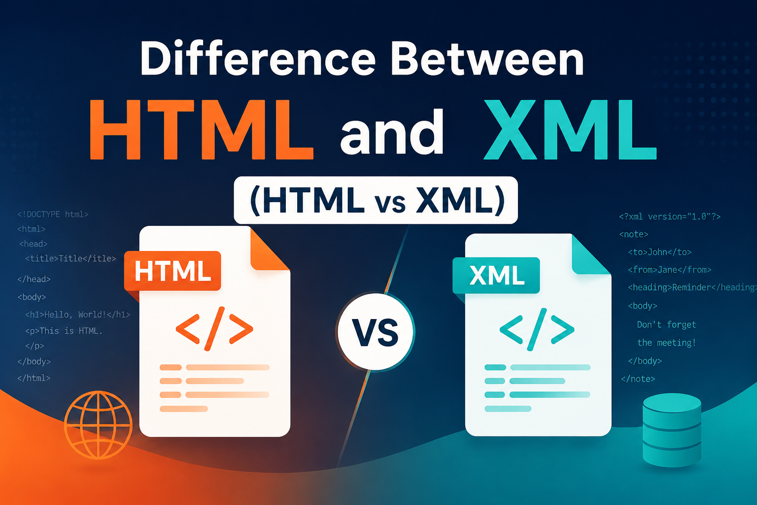
Difference Between HTML and XML (HTML vs XML)
NEW
CBSE 12th Result 2026 Re-Evaluation: Apply Online, Fees, Last Date & Step-by-Step Process Explained
NEW
NEET UG 2026 Re-Exam Date Announced: Check New Exam Date, Schedule & Latest Updates
NEW
Understanding the SSC Phase 14 Exam: A Comprehensive Overview
NEW
Top Study Tips for Cracking Your Exams with Confidence
NEW
Aerospace Engineering: Scope, Courses & Career Opportunities
NEW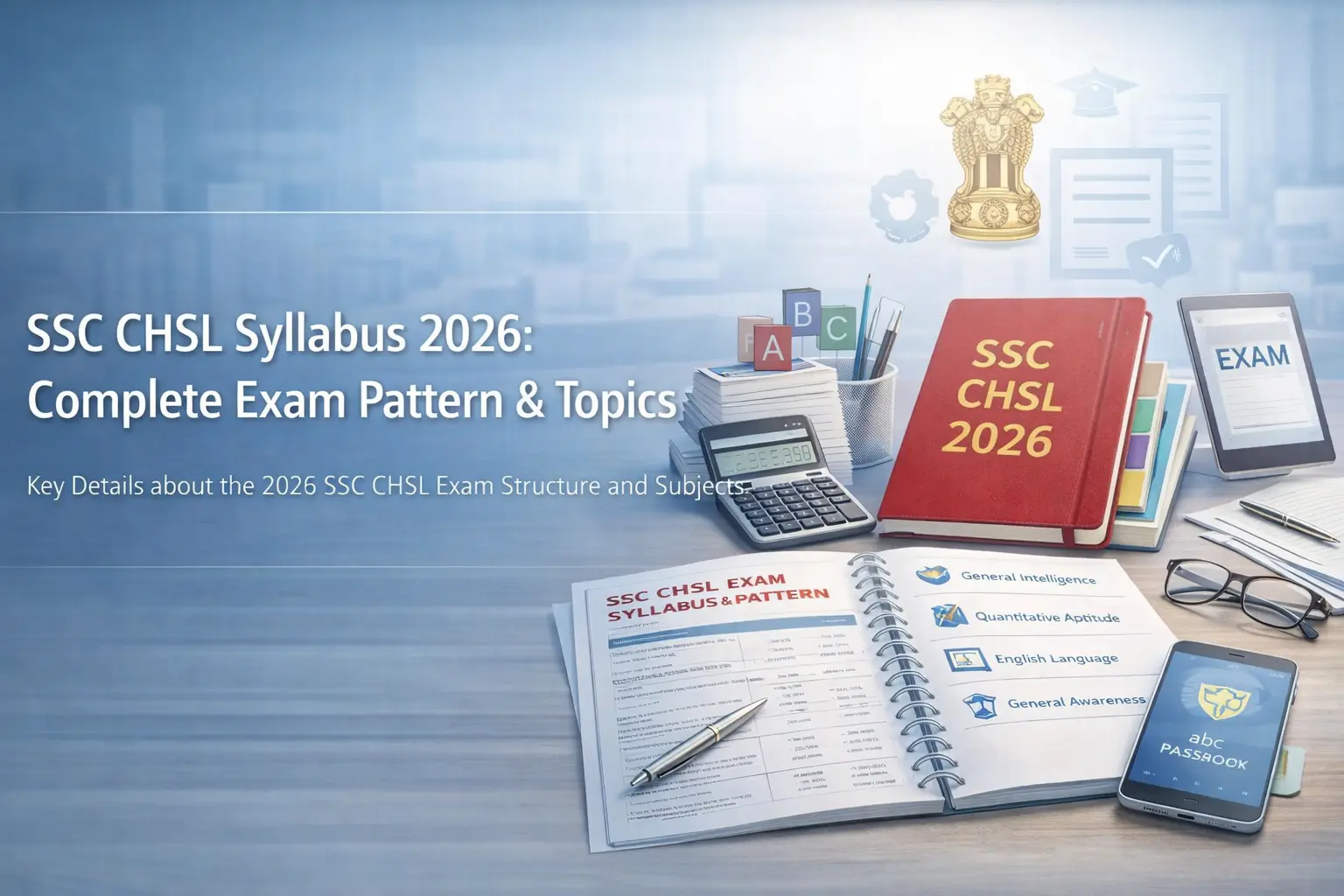
SSC CHSL Syllabus
NEW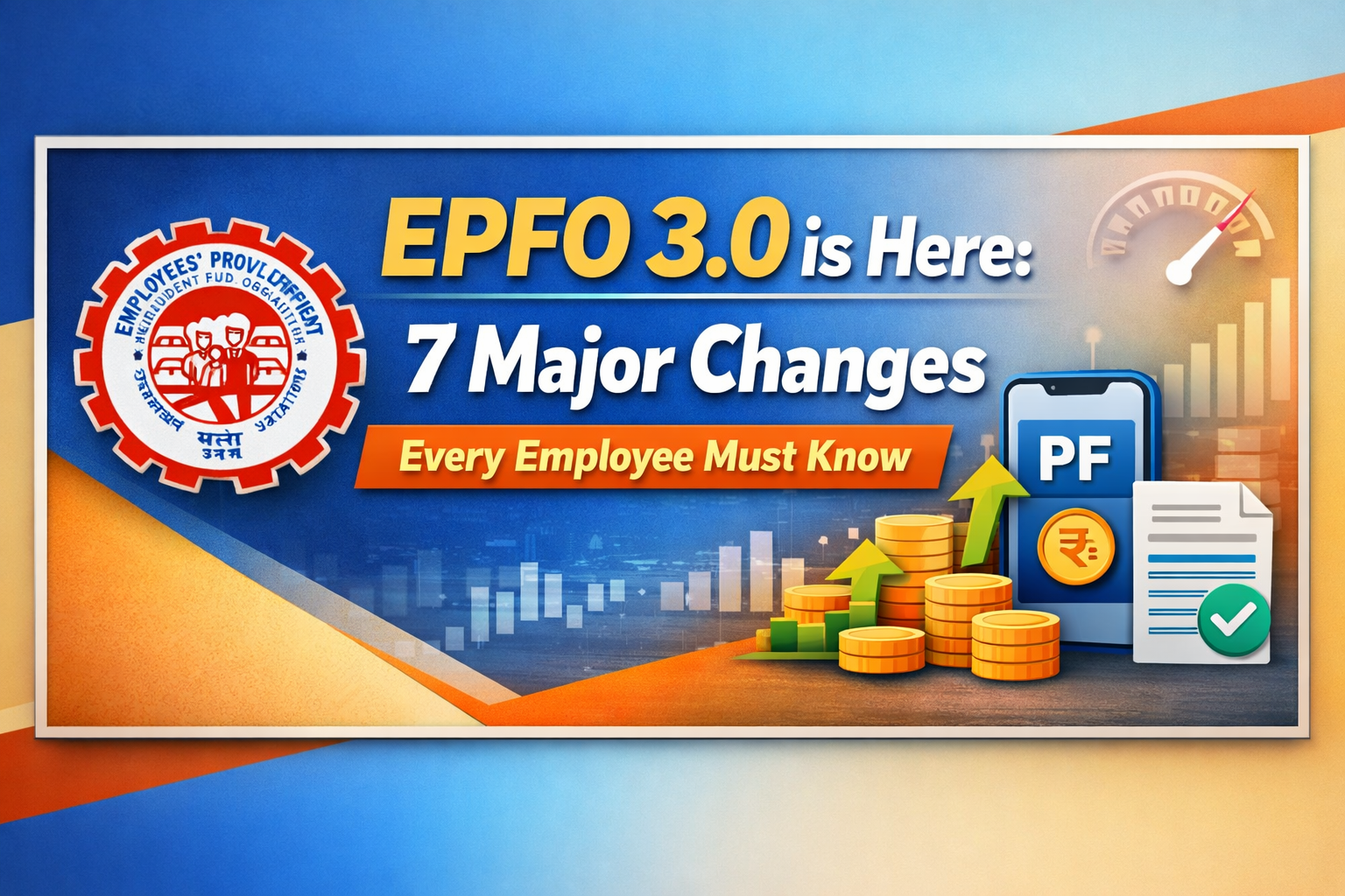
EPFO 3.0 is Here: 7 Major Changes Every Employee Must Know
NEW
Indian Army Salary Structure
NEW